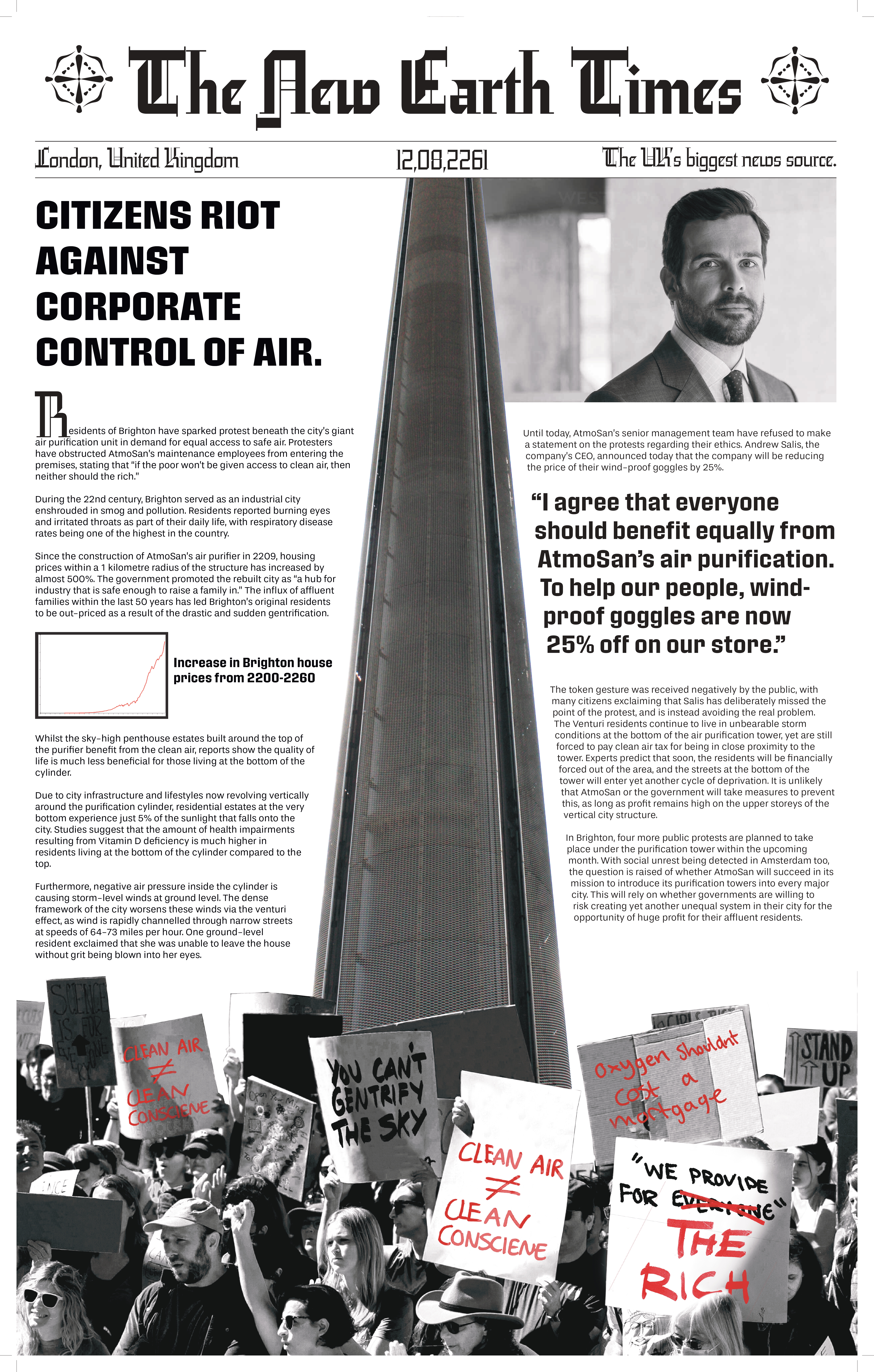
A speculative University project exploring what could happen if corporations
found a way to control the demographics of polluted cities through access to clean air.
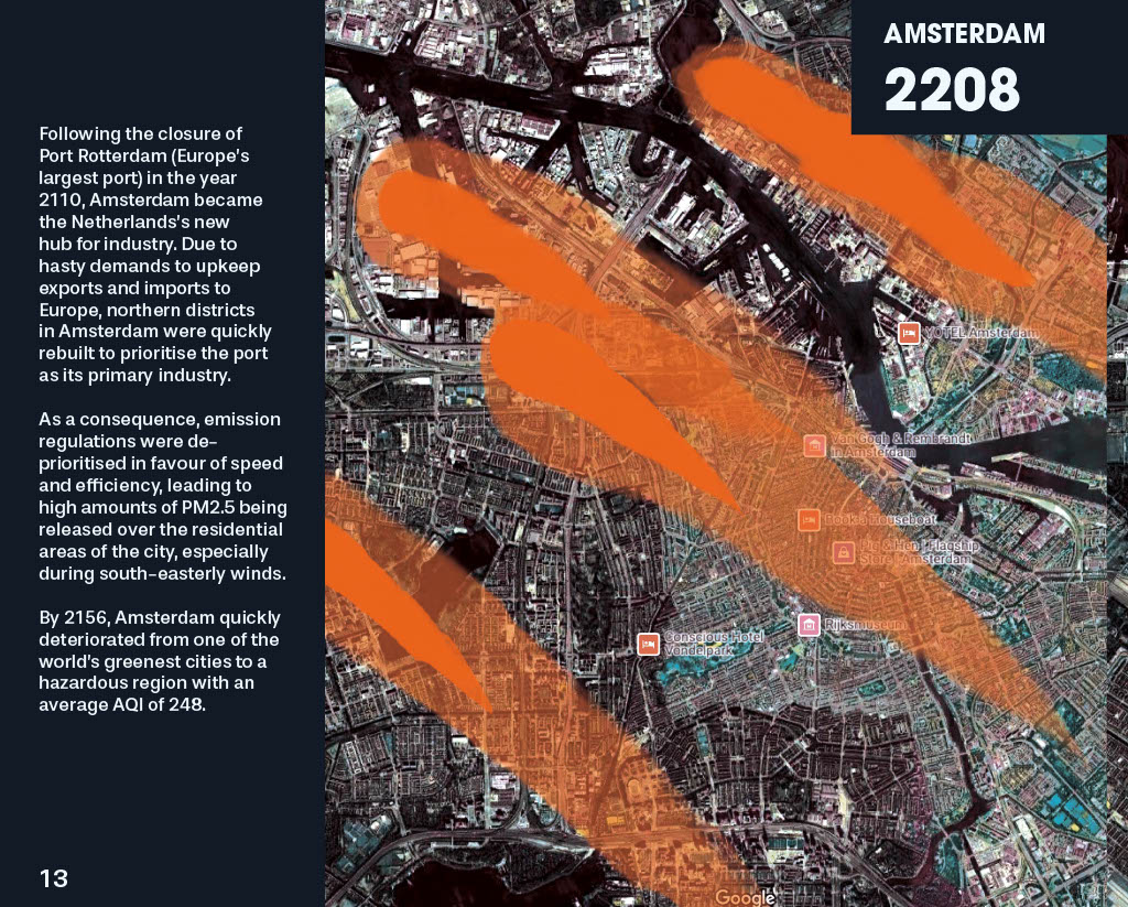
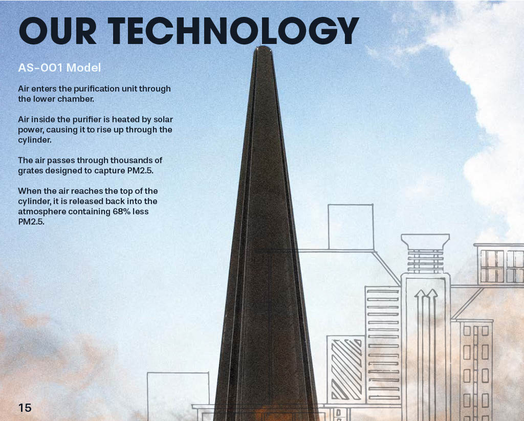
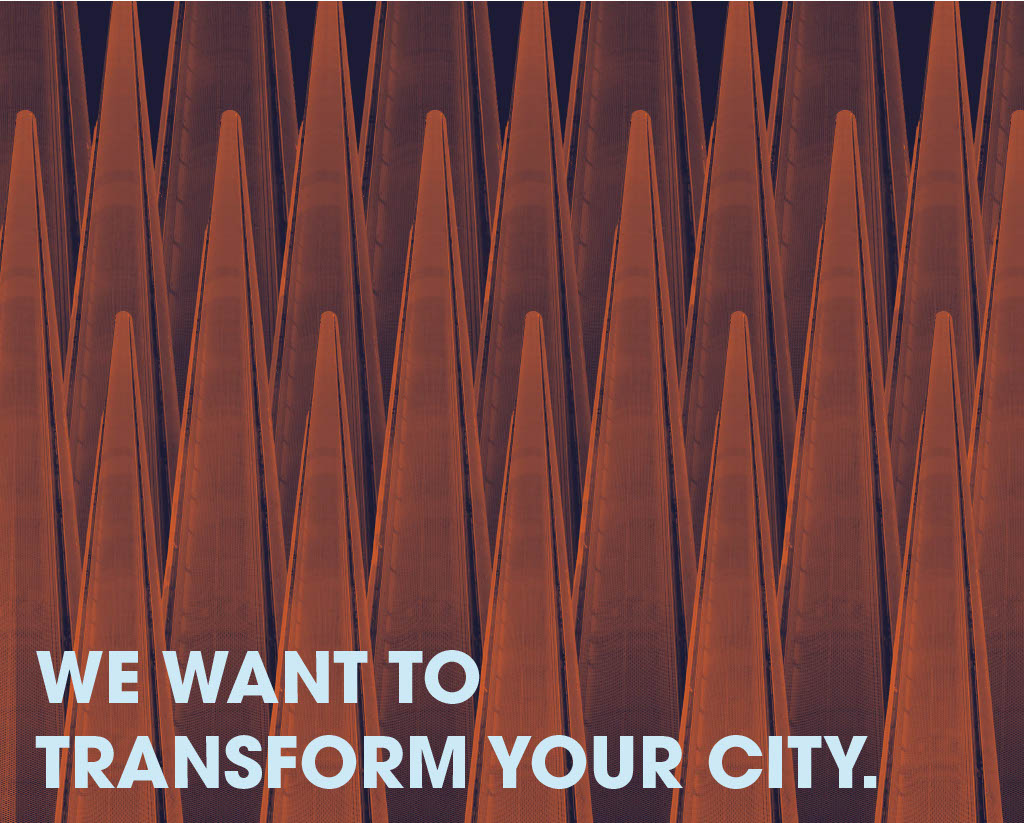
Air-Purification Towers on an enormous scale form the foundation for speculative cities to build their societies around,
with clean air being emitted from the top of the tower.
This printed publication explains the worldbuilding of this project from AtmoSan's problematic point of view.
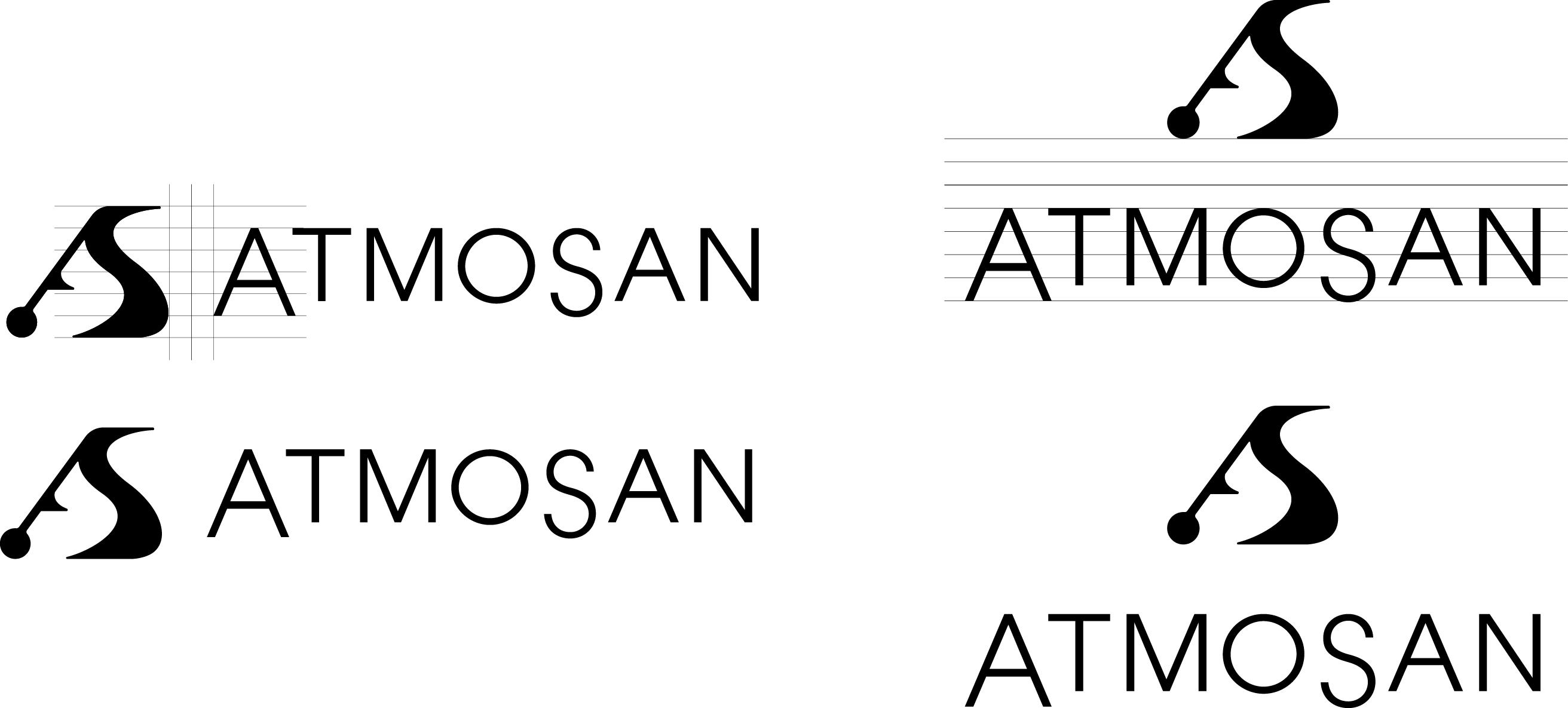
Interlinking modular A and S letterforms to resemble a chain. This would symbolise AtmoSan's connectivity, but would also hint more deeply to the company's restriction on society. Further refinement of the previous idea, this time using characters from the geometric and Swiss design-inspired 'Roc Grotesk' typeface, eluding to a more corporate look.
I dropped this idea because I felt it was lacking in visual context.
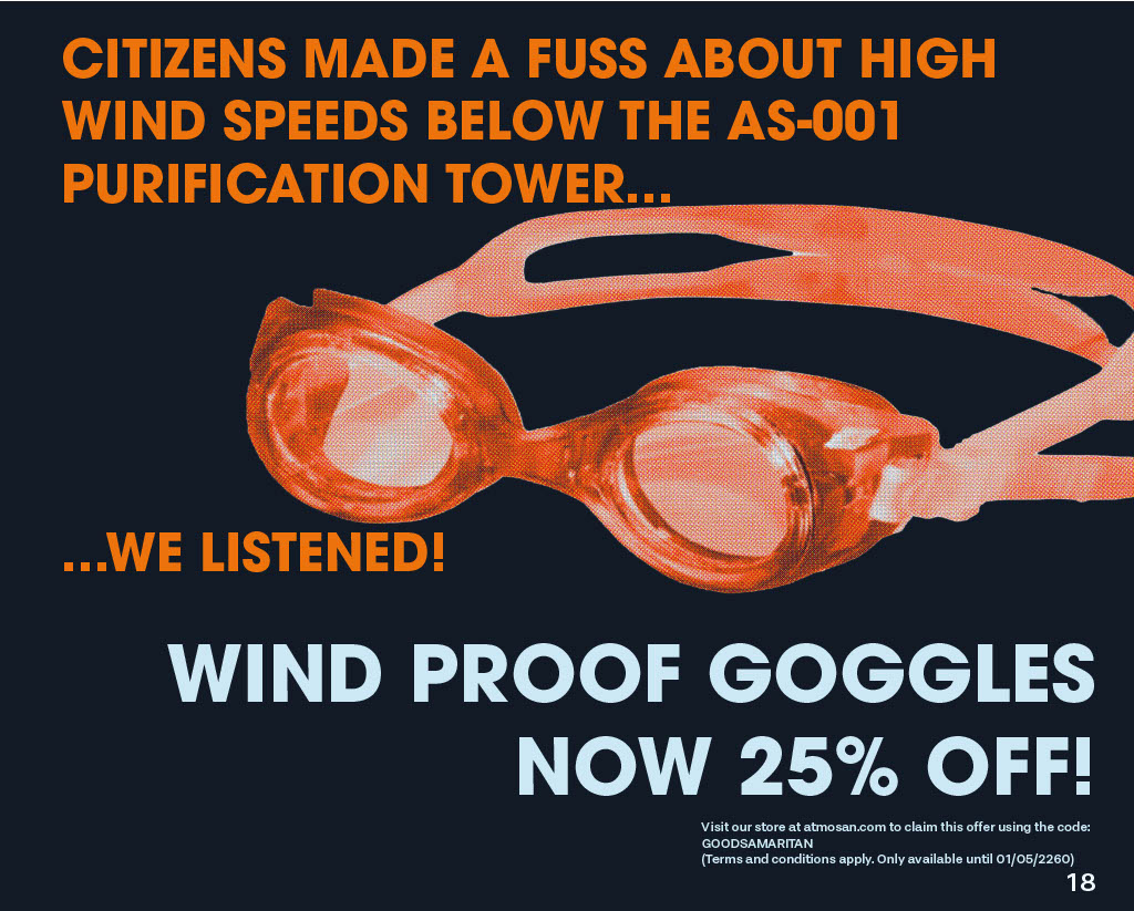
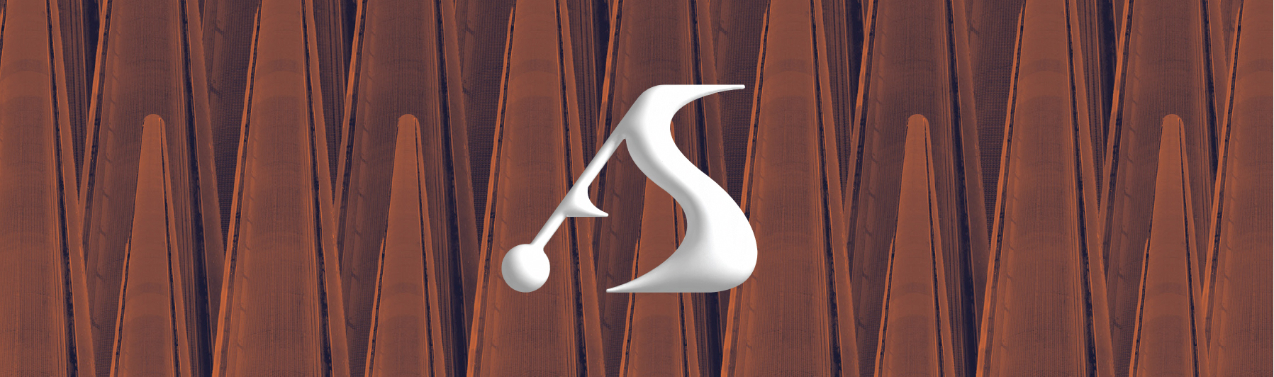
The AtmoSan logo derives predominantly from the Beaufort Scale icon.
The MetOffice have used the Beaufort Scale since the early 19th Century to indicate wind-speed
and air movement. This icon in particular signifies storm winds at 64-73 miles per hour.
Gail winds at these magnitudes have been recorded to occur in areas close to the
underside of AtmoSan’s air purification units, due to the rapid movement of air into its chamber.
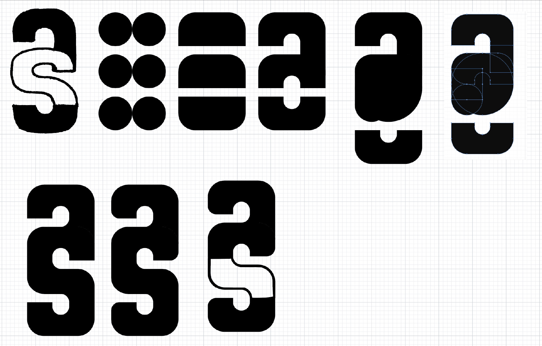
Logo Concept: 01

Logo Concept: 02