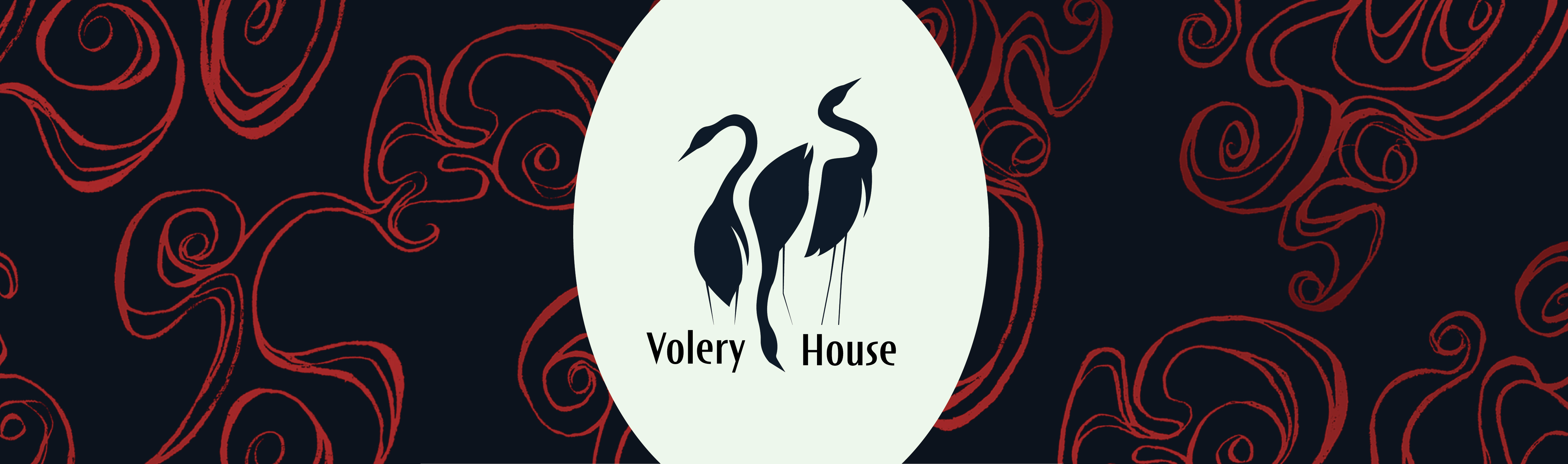
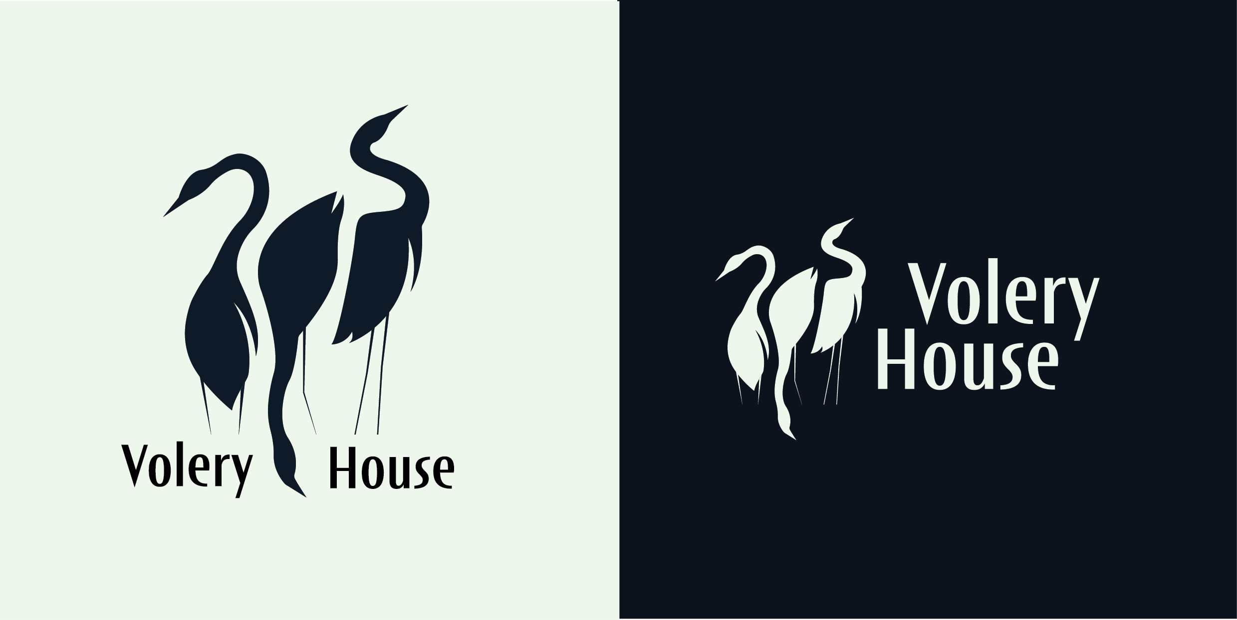
Volery House
Logo and branding project for Volery House: a production house that creates visual media through theatre, film and audioplays. Their core strengths are that of immersion, emotion, and a touch of the macabre.
- Logo and visual identity
- 2025
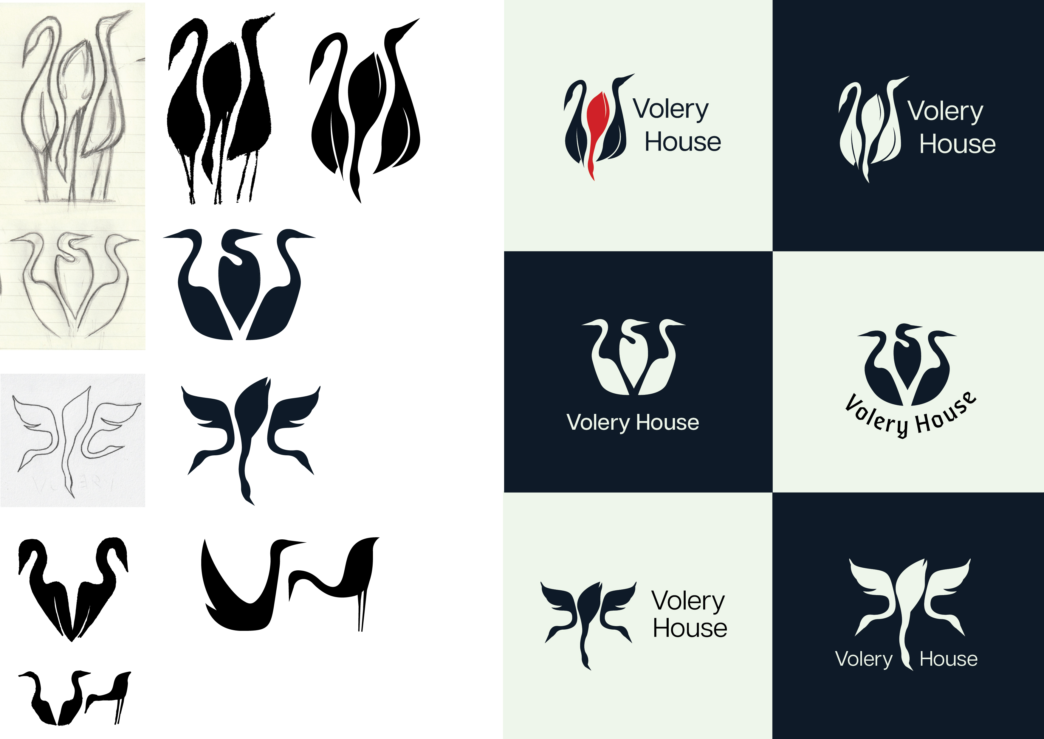
Process
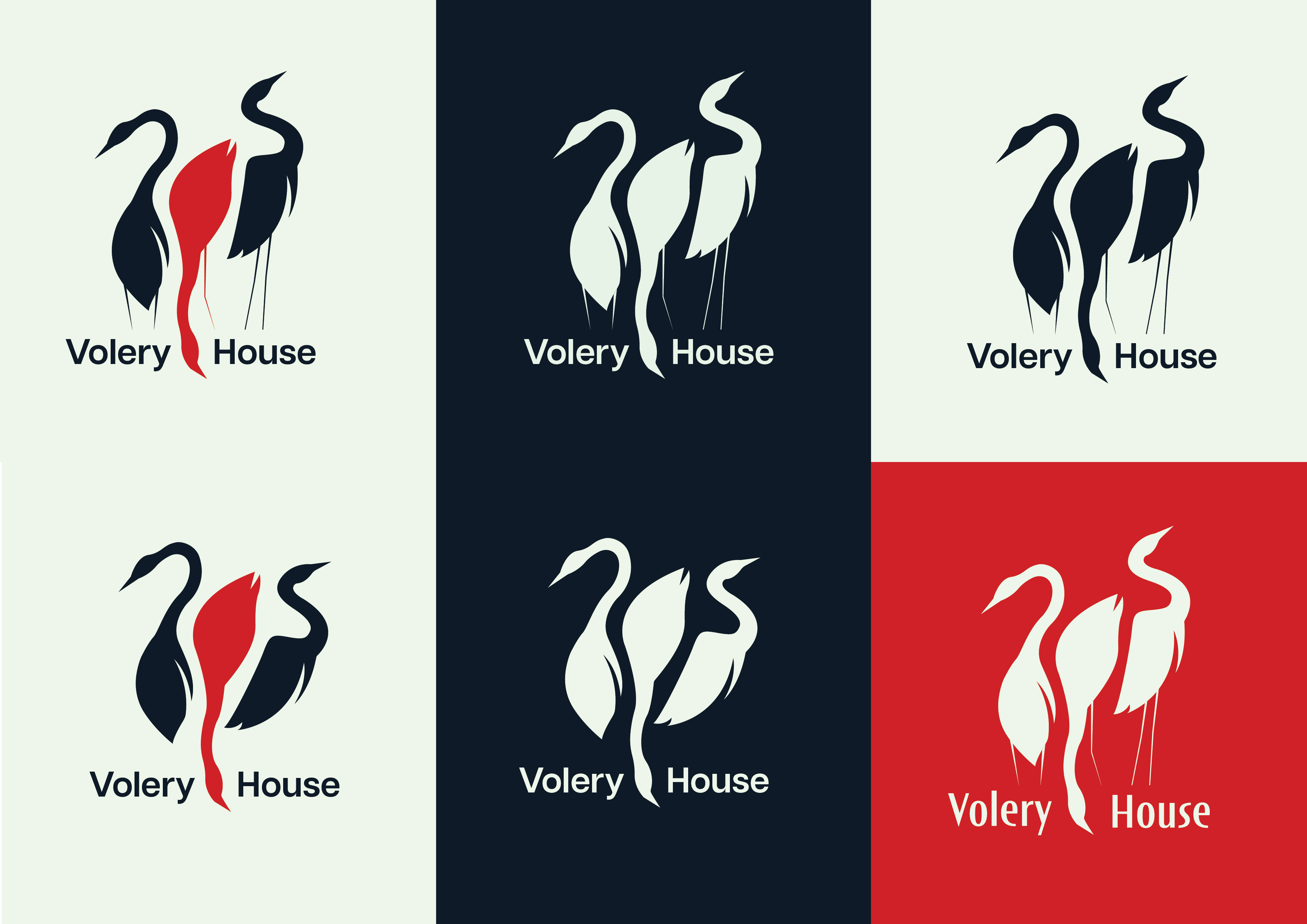
My client requested the imagery of three Great Egret birds in the logo, to represent Volery House's three co-founders. I began by sketching ideas by hand, then digitalising each one as a vector.
Refinement
After discussing with the client, I refined a previous sketch by giving the birds more realistic and recognisable proportions.
Typography
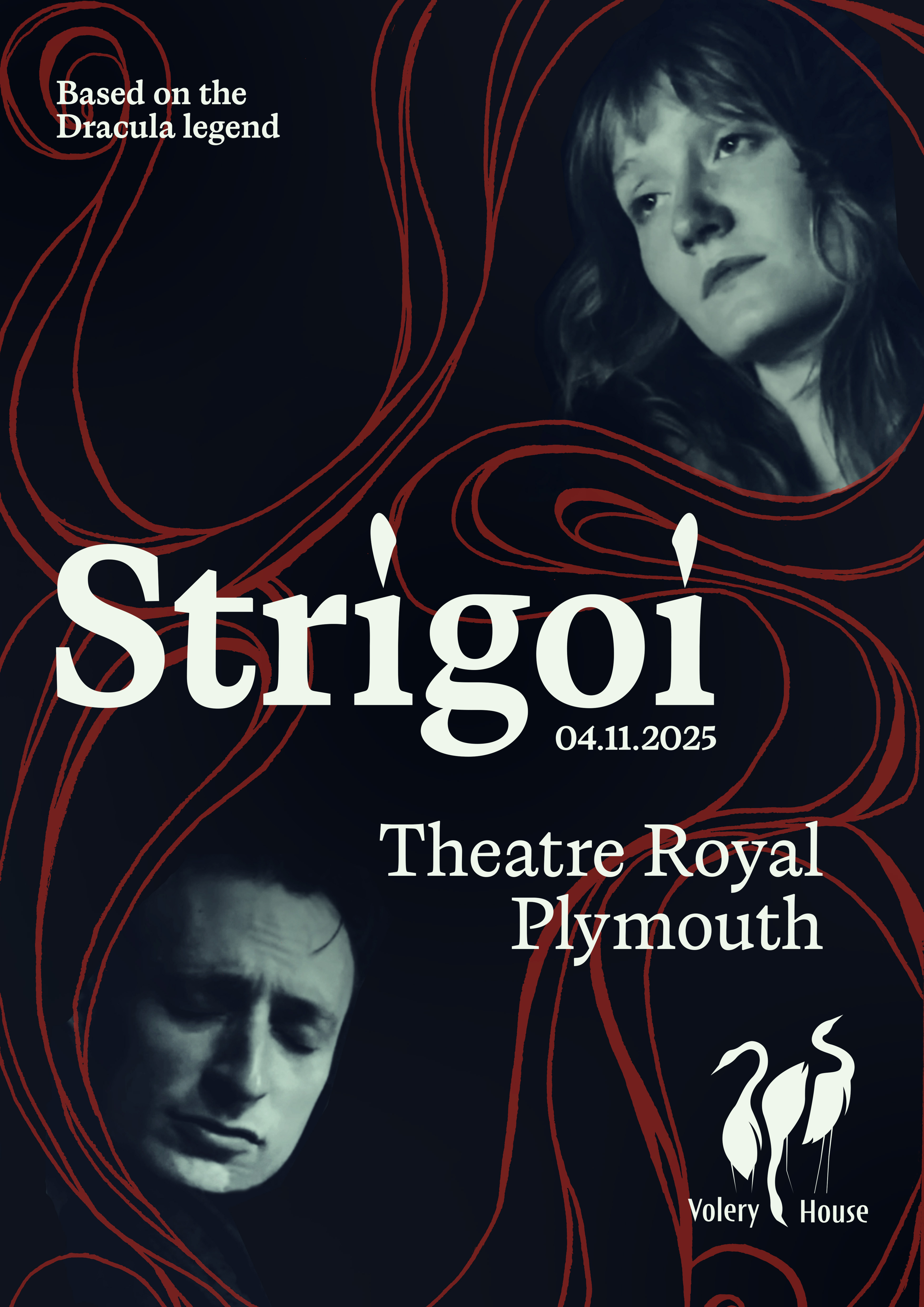
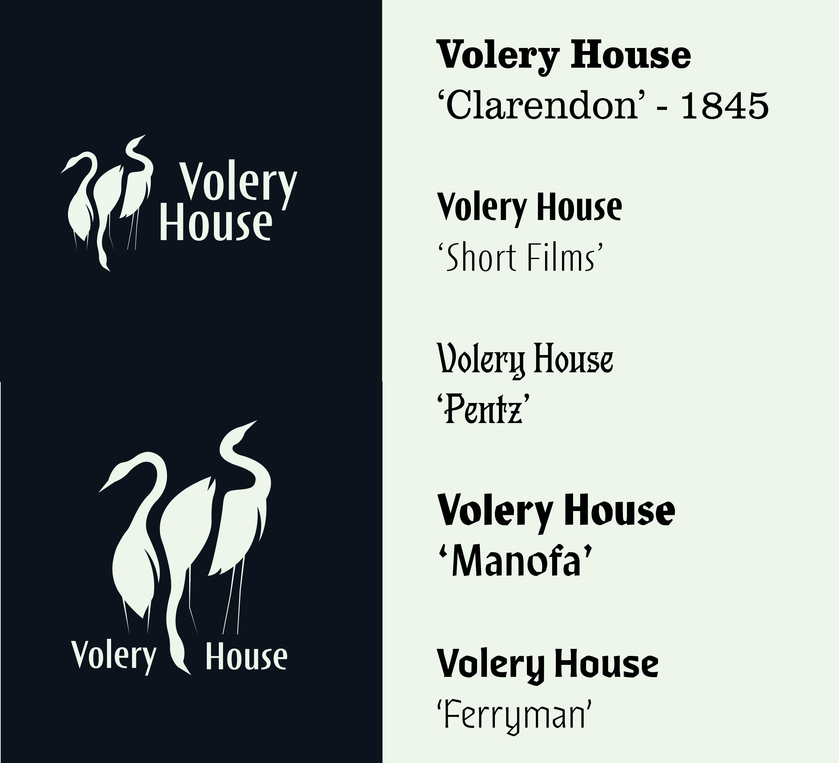
I researched a large variety of typefaces to ensure the context of the lettering matched the core values of the company. As my client requested a professional and clean feel, I began with contemporary typefaces inspired by Swiss typography. After agreeing that the typeface needed more of a flair, I drew inspiration from Volery house's production of 'Strigoi', a re-imagined take on the Dracula story.
The Short Films typeface, designed by Ryoichi Tsunekawa at Dharma Type, is the most suitable for this project. It hints towards an Art Deco style, blending geometric and humanistic styles. It gives the brand professionalism whilst informing the audience of the company's personality.